


Today, the corporate world is so competitive that businesses need to use every possible marketing tool at their disposal to reach the top. This means ensuring that their brands have a distinctive presence and that they actually grab the target audience’s attention. One of the easiest ways to do this is to use typography design.
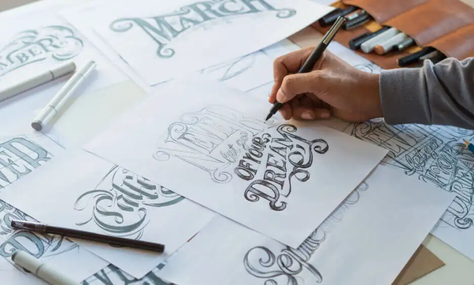
Typography is everywhere. You’ll find it in notes, instruction manuals, books, posters, magazines, logos, websites, and even storefronts with signboards or displays and more. Basically, anything that has and uses text written in some kind of attractive typeface instantly grabs our attention. There are two reasons for this. One, we’re interested in what we see and two, the information is presented in a visually attractive manner.
However, while we appreciate what we’re seeing, we’ll never understand the designer’s role in emulating the tone behind the words or sentences. So much goes into deciding how to present information to any audience. The designer must consider the relationship between the look of the text and what the text says. This is tricky because one can express a multitude of moods, atmospheres, and even trends simply through the type choice. Which brings about 2 questions – what is typography design? — and why is it so vital? Especially if one plans to use it in graphic design. Let’s find out.
What is Typography Design?
In simple words, typography design is best explained as carefully arranging letters and text in a way that makes text legible, clear, and visually appealing to anyone reading it.
The idea behind doing this is to get a reaction out of the reader and elicit certain emotions, conveying a specific message at the same time. This means paying extra attention to font style, appearance, and structure, through which, typography comes into play, breathing life into the text. For these reasons, graphic designers need to be skillful in using typography to create impactful website designs, brochure designs, print designs, books, and computer graphics.
What role does it play and why is it important in Graphic Design?
Typography has two vital roles in graphic design. One is to ensure that the text is legible, and the other is to convey the messaging, tone, and sentiment of a design piece clearly and carefully.
Typography has yet another function revolving around aesthetics. When we look at designs, we tend to be more drawn toward visually attractive designs, that are clean yet bold. If there’s too much going on in a design, turning it into a confusing mess, we’re going to turn away and look at something else. For these reasons, it’s imperative that we learn how to take typography, use it to our best advantage, and churn out graphic designs that have a positive impact on clients.
However, there are a number of other reasons why typography is really important in graphic design. Let’s check them out.
Deliver a message clearly, concisely, and effectively
When creating a design, you’re attempting to communicate a message. This means that you have to be careful and clear with your use of typography. The message in the design has to be legible and meaningful. Most designs are primarily image-based. Therefore, you must ensure that the typography is completely noticeable. If the design calls for lots of text, the typefaces used have to be strong enough to differentiate between sections and draw the audience’s attention to important messages. Whatever it is, you need to ensure that there is a proper and harmonious balance between the multiple competing elements to get the primary message across clearly and effectively.
Create a visual hierarchy
Typography design is used to create a great visual hierarchy. The point of hierarchy is to direct the audience to the most important element in the design. For example, take brochure design. The designer uses typography to determine what a visitor should read first, through sizing. Here, the largest element on the page will draw the viewer’s attention. This kind of graphic design is typically text-heavy. Meaning, the headlines are the first thing that one sees since these are bigger than the text in the body. Another way a designer can use it to create a hierarchy that stands out is to use different typefaces. For example, the designer may use a geometric sans serif typeface for headings and a classic serif for the body.
Build and boost brand recognition
Brand recognition is a crucial component in helping businesses deal with their competition. Typography plays a vital role in graphic design when it comes to building brand recognition. Most brands rely on a combination of high-impact visuals and great logos, the latter of which relies on typography, to show their presence in the market. Think of logo designs. There are so many easily recognizable brands thanks to the typography design used to create their logos. For example, Coca-Cola, Google, Disney, etc. Each of these brands has used a specific typeface for their logos. Using this design aspect to build brand recognition allows for a special bond and feeling of familiarity between the brand and the consumer.
Create a strong visual impact
Every brand looks to leave a lasting first impression on visitors and consumers. Typography design plays a crucial role in making this happen. Today, most brands use larger fonts to create a bold visual impact. The reasoning behind this is that they convey the brand or design’s message very clearly. If your brand isn’t getting views or visitors, it just might be time to take a look at all your marketing materials and rework everything. If something isn’t working on your website, brochures, business cards, logo, etc., you may need to engage the help of an experienced graphic designer and get things redesigned to be more effective.
Give personality to your brand and designs
Typography design is a great way to give your brand or design a distinctive personality. Depending on the typeface used, both or either of these can be friendly, playful, sophisticated, serious, etc. You can even use a combination of typefaces to show what your brand or the design personifies. It’s recommended to create unique designs. However, given that various typefaces and fonts carry different characters and meanings, it’s also necessary to be extra careful. When it comes to a particular brand. a designer needs to understand the brand’s traits properly before selecting the right typeface that will bring out the brand’s personality efficiently.
Set the right mood and tone
We’ve talked about how typography design can be used to give your brand a unique personality. Similarly, you can use it to establish a mood and tone for your brand or even a particular graphic design piece. The right typography design can also help bring out the brand’s values without being overly explicit about them. Different typefaces also have the power to elicit different emotions and reactions from viewers. You’ll find that most graphic designers typically go for sans-serif typefaces. These are modern-looking typefaces that give a design a clean, simple, and easy-to-read look on a large scale. This means that they are generally the go-to typefaces when a designer creates a brochure or a writer creates a blog.
Engage the audience’s attention effectively
Every brand has a message that it wants to deliver to consumers. Typography design plays an important role in helping to deliver important messages. In fact, using the right kind in a design is guaranteed to make the text stand out and have a positive impact. There are different ways to draw the audience’s attention such as increasing the size, using different colors, and changing the font or typeface. A designer can use all of these to ensure that they deliver the brand’s or design’s message efficiently and effectively.
Make text reader-friendly and legible
A graphic design or a webpage with tiny text makes readers strain their eyes. More so, it makes the design appear cluttered. Then, there are times when the wrong fonts are used, rendering the design a complex mess. The designer may want to create a fun but informative design which they can achieve provided that he or she uses typography design carefully.
Create the right harmony and consistency in a design
Brand identity design has to be consistent in every aspect. Typography design, when done correctly, creates harmony as well as consistency in a design. Visual consistency has a powerful and positive impact on viewers. Take website design, for example. Using consistent headings, colors and typefaces ensures that the design is professional and has a streamlined look. In turn, this also encourages brand recognition. Another important point to note here is that a harmonious design is easy to follow and visually appealing.
Using Typography design in the right way to get the right results
Typography is an art form and a skill that takes time to master. A graphic designer who works with typography needs to have a well-trained eye and lots of practice in order to get things right. It’s a vital part of graphic design. Here, the focus is on text turned into visuals to deliver an impactful brand message. We know how to do this at Synapse, the best graphic design agency in India. Our team of graphic designers has done some marvelous work with the same for different brands in the country. Check out our services and give us a call on 1800 121 5955 to set up a meeting and get a quote. Write to us at contact@synapse.co if you still have questions for the team.


