


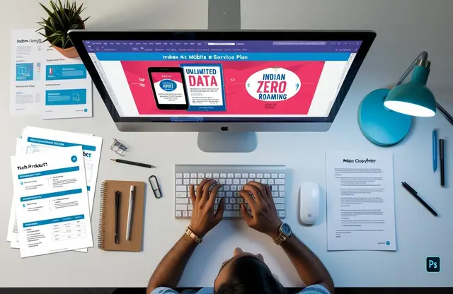
In an age of social feeds and pop-ups, flyer design still grabs real-world attention where it matters. Handing a bright, high-quality sheet to someone feels personal, quick, and hard to ignore. It puts your message straight into the hands of your target audience without fighting an algorithm. Better yet, the cost stays friendly for small businesses that need a big impact on lean budgets. When you hire a skilled graphic designer, every colour, image, and margin works to guide the reader. Smart layouts borrow lessons from brochures but keep the story short so no word goes to waste.
Creative typography then leads the eye from a punchy headline to a clear call, making every second count. All these details feel invisible to most readers, yet they add up to a piece that looks professionally designed and trustworthy. That polish makes onlookers pause. They scan the page and may share your offer with friends. This turns strangers into potential customers. Need to announce a grand opening? Or spark weekend sales? Focus on flyer design. It can create an eye-catching first impression. Invite action with clear next steps. Print houses today can turn small batches around in a day, so last-minute promotions stay on schedule instead of missing momentum. The rest of this guide walks you through planning, artwork, and print, step by step, with real examples to make life easier.
Why Printed Flyers Still Build Real-World Buzz
Printed marketing still has skin in the game. Even in smartphone-soaked cities, a neat sheet that lands in your palm can spark fast buying decisions. That’s why the old-school handout still stirs buzz across India’s bazaars and high streets.
Indian readers notice flyers. A 2024 direct-mail study logged a 4.61 % average response for a flyer or brochure, better than postcards or SMS. Pitch Madison’s latest report backs this up: print still claims 20 % of national ad spend and is growing 7 % year-on-year. Paper hasn’t lost its punch.
Money math agrees. Newspaper inserts in Kolkata cost roughly INR 300 per 1,000 copies. With that 4 % response, each lead comes in at near INR 7. Mid-ticket Facebook campaigns often hover at INR 200-300 per lead. One line sums it up: flyers fetch a qualified lead for under ten rupees, while an online click-to-lead can cost twenty times more.
Beyond spreadsheets, people trust what they can hold. Tangible flyer design lets brands weave graphic design elements—colour, texture, fresh-ink scent—into an honest story. That weight, paired with sharp visuals for your flyer, beats an on-screen scroll. Marketers label it “marketing collateral,” but customers see proof you’re real.
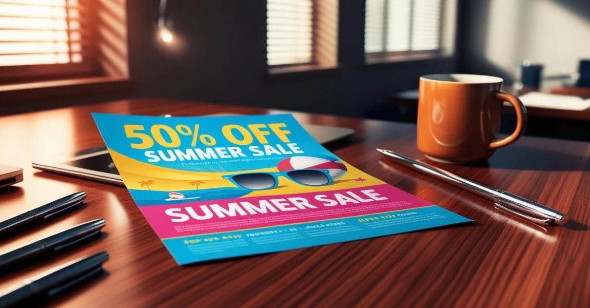
Looks matter. Follow clear design principles, add one striking image, and you create stunning first impressions. Think of it as designing a flyer that starts a friendly chat. When done right, the sheet slips into a purse or onto a fridge and keeps whispering your offer long after phone pings fade.
Need street proof? A Pune pizza outlet added an INR 50 coupon to 5,000 door-delivered flyers. Lunchtime footfall jumped 25 % in the first week, and repeat orders rolled in because diners kept the coupon handy.
No wonder local retailers still swear by flyer design. It’s quick, cheap, and personal.
Flyer Design Basics: Size, Stock, And Structure
Choosing paper, size, and layout shapes first impressions. This quick guide keeps flyer design sharp, on budget, and press-ready for India’s streets and social feeds, whether you’re teasing a gig or promoting a café menu.
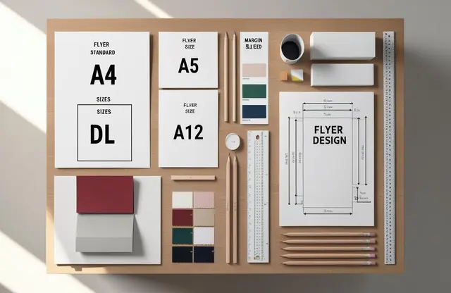
Most printers stock three crowd-pleasers. A5 measures 148 × 210 mm – easy to hand out yet roomy for offers. DL stands at 99 × 210 mm, perfect for rack cards or letterbox drops. Half-letter, roughly 140 × 216 mm, slides neatly into bags. Pick the flyer size that fits your message, then scale the artwork; each format is fully customizable.
Paper weight changes how a business flyer feels. Go 130–170 gsm matte for mass runs and notepads. Jump to 200 gsm silk for a premium promotional flyer packed with high-resolution photos or illustrations and custom graphics. Glossy stocks boost colour pop; matte reduces glare for text-heavy pieces. Heavier 250 gsm gives sturdy hand-outs that travel without creases. Readers notice the difference, yet each sheet costs less than a digital click.
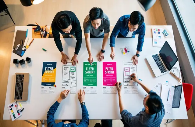
Keep your copy tidy with a simple three-panel grid that any creative agency can design for you. Panel one hooks with image and headline; panel two explains benefits; panel three drives action and includes QR codes for social media. The grid honours brand guidelines, locks in clean typography, and ties all brand collateral design together.
Bleed tip: extend backgrounds 3 mm past each edge, then keep logos and text 5 mm inside the safe zone to dodge the guillotine.
This structure makes flyer design a breeze, ensuring that your flyer prints flawlessly and looks great in every hand.
Craft Short Copy That Triggers Fast Action
Smartphones may rule, yet Indian shoppers still skim print in seconds. With only eight-second attention spans to spare, lean copy inside flyer design must land fast, feel fun, and push the reader to act now.
A bold headline of five punchy words lifts response more than rambling lines. Marketing studies recommend 5-to-10-word headers, so aim for the low end to keep eyes locked. Pair that line with one high-quality image, and maximize stopping power before the page turns.
Next, split the body into two crisp benefit bullets. Short lists are easy to scan, especially when smart typography highlights key nouns. Mention a clear gain, like saving time, then quote a real number of customers served to build trust. Bullet points cut fluff and beat dense text blocks for grabbing attention on a busy business flyer.
Close strong with one focused CTA and a deadline. Urgent phrases tied to a date can double conversions, while extra options dilute intent. Add your contact information and a QR code that opens your social media page. Even a standard flyer should promise scarcity – “Offer ends Friday” works, then stick to it.
Sample copy (for a customizable flyer design):
Headline: “Weekend Saree Sale 50% Off”
Bullets:
- Hand-woven silk and cotton picks.
- Free blouse stitching for the first 50 buyers.
CTA: “Show this flyer by 7 p.m. Sunday. Drape elegance for less.”
Always delete filler before going to print and the press. Tight words get the word out, keep costs down, and let flyer design shine.
Visual Tips For High-Impact Flyer Design
When you shape flyer design, pictures, colours, and tiny symbols work together like street musicians in harmony. Get each piece right, and the sheet becomes a silent seller long before a word is read.
Consistent brand colours glue memory. Researchers note that colour alone can lift recognition by up to 80 percent, so keep every swatch identical across ads, stalls, and other marketing collateral design.
Balance one hero shot with generous white space. This breathing room directs focus to eye-catching images and prevents the page from looking cluttered, especially when people read at arm’s length on crowded streets.
Icons act as signposts. Sprinkle simple symbols near numbers, maps, or phone lines; these design elements make contact details instantly obvious for skimmers.
Mini colour-contrast checklist
- Text vs background ≥ 4.5 : 1 for small type.
- Big bold headlines ≥ 3 : 1.
- Test your palette with any online ratio checker before going to print and press.
Need icons? Heroicons offers 300-plus MIT-licensed SVGs—free to use in print. Flaticon supplies thousands more if you credit the artist.
More Visual Tips
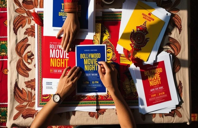
- Flexible layouts in customizable flyer design let you swap offers fast without redrawing the grid, saving both ink and rupees.
- Spot varnish on one keyword can make your flyer stand out under store lights and invite touch.
- Arrows or dotted lines create helpful design cues that guide eyes naturally from headline to price to call-to-action.
- Choose thicker stock for take-home menus and thinner for events; match paper feel to specific flyer needs without overspending.
- A professional designer can align colour profiles across digital and offset presses, avoiding dull reds or muddy blues.
- High-resolution gradients around borders can create stunning flyers while keeping the centre calm and readable.
- Use ready-made palettes to overcome creative bottlenecks when deadlines shrink; refine later if time allows.
Master these visuals, and your next sheet of paper will sing stronger than any screen, proving again why flyer design thrives on clarity and charm.
Choose Synapse For End-To-End Flyer Success
Twenty-five years in, Synapse’s design expertise has only sharpened. Our seasoned team combines fresh thinking with battle-tested design skills that turn rough ideas into print-ready art. Expert copywriters craft crisp headlines, illustrators add personality, and trusted press partners keep colours honest. Together, we create the perfect flyer that speaks louder than any screen.
We sweat the small stuff. Simple design tips like tight grids and bold contrast come baked into every layout, making each piece an effective flyer that invites action at a glance. Rigorous quality checks catch misalignments before they hit the press, slashing waste and costly reprints. Deadlines never slip; on-time delivery is part of the promise that helps clients spread the word without last-minute stress.
Ready to see smart collaboration in action? Browse our Showcase to view flyers, business communication materials, and full campaigns for brands you know. Then talk to us. Call 1800 121 5955 (India) or email contact@synapse.co to chat with our experts. Prefer WhatsApp? Or drop us a message on our Contact Form, and someone from the team will reply fast. Synapse is the top agency for graphic and business communication design in India, and we’re here to turn your next promotion into print that works.


