


A strong brand often starts with smart logo and font design, and it’s usually the first thing people notice. When both work well together, they make your business look sharp, confident, and memorable. That’s why logo and font design isn’t just about choosing a pretty icon or a clean font. It’s about creating a visual style that speaks for your brand long before you say a word.
Every element matters. Your typeface should match your personality. Your layout should stay neat and easy to recognize. Even small choices, like using three or fewer colors or picking the right logo font, can shape the impact of your logo on business cards, social media posts, and print layouts and illustrations. The goal is simple: make a logo that feels yours, looks good everywhere, and tells the world exactly what you stand for.
Many brands try to experiment with different design elements on their own, but the process can get confusing fast. Should you use a wordmark logo? Should you customize a new font logo? And how do you convey with your logo the message you want in just three to seven memorable words?
That’s where a skilled design team makes all the difference. When experts guide you, it becomes easy to create a logo that feels right, looks polished, and helps your brand stand tall in any space, even in a crowded market.
Why Logo And Font Design Matter For Brands
A strong brand needs visuals that speak the right message from the very first glance. That’s where logo and font design step in. They set the tone, build trust, and help people remember you long after they’ve moved on. When done well, they make your brand feel clear and confident. When done poorly, the cracks show quickly.
A logo is the main symbol people connect with your brand. It can be an icon, a wordmark, or a mix of both. Typography, on the other hand, is the style of letters you use across your brand. It includes the typeface, spacing, weight, and the overall look of your text. Together, they shape how your brand identity sounds and feels visually. A simple change in letter designs or a clean font can shift your whole identity.
When your logo and chosen typeface work well together, they create stronger brand recognition. People can spot your business name faster. They can link your values to a clear visual style. Even small choices, like using a perfect font logo on social media posts or choosing a layout that feels balanced, help people remember you. These elements build trust without saying a word.
But weak design does the opposite. A confusing icon, a random mix of different font styles, or a layout with no structure can hurt your brand. It leads to mixed messaging and makes it harder for people to recall you later. Even a new logo that looks rushed or uses design elements carelessly can make your brand appear unprofessional.
That’s exactly why working with a skilled team matters. Synapse understands how to find the perfect balance between visuals, clarity, and meaning. With professional design support, you avoid confusion, get a polished identity, and give your brand the confidence it deserves. Your logo and fonts are part of a larger branding and graphic identity system that shapes how people see you.
How To Choose The Right Logo And Font Combination
Choosing the right visual style for your brand should feel exciting, not confusing. A smart pairing of colors, shapes, and type creates a look that feels natural and true to who you are. When you get this mix right, your brand becomes easier to recognize everywhere. That’s why the way you approach logo and font design really matters.
1. Understand Your Brand Personality
Start by getting clear about who you are as a brand. Are you serious, playful, bold, caring, or modern? Each personality leads to a different visual direction. A fun brand may lean into round shapes, while a confident brand may prefer strong lines. Even choosing a customizable font or a calm layout becomes easier when you know your core traits.
2. Know Your Audience And Your Market
Think about the people you want to speak to. Younger audiences often respond well to simple shapes and a clean font. Professional crowds may trust more refined design elements. It also helps to look at your competition. This shows what works, what doesn’t, and what you should avoid. It also stops your new logo from looking like everyone else’s and helps you explore different types of logos.
3. Match Your Values With A Suitable Design Style
Your values guide your style choices. A bold brand may choose solid shapes, while a minimalist one may use lighter strokes or a serif typeface. Simple choices, like adding a logo with a transparent background or using three or fewer colors, help your visual identity feel more stable and consistent.
4. Check Readability, Scalability, And Color
A logo must work everywhere, from tiny social media posts to large print layouts and illustrations. So readability matters. Your design should scale without losing clarity. Colors also play a role. Some shades look great on screens but fade in print. A clean font or a simple set of design elements keeps the logo easy to use.
5. Let Fonts And Logos Support Each Other
A logo becomes stronger when the font supports the shape of the icon. A bold symbol pairs well with a softer, modern letter style. A thin mark may need a steady wordmark logo to feel balanced. Even small choices, like how your business name sits below the icon, can help you find the perfect version of your logo.
6. Trust A Structured Design Process
This is where Synapse brings clarity. The process begins with a deep look at your brand personality, audience, and competition. The exploration then moves into a wide range of fonts and layout options to find what fits best. Each symbol is tested across different backgrounds, including vector files like PDF and SVG, to ensure it stays sharp everywhere. Work done for Doc Vidya and the Pia GDIZ redesign shows how a structured approach results in a polished, eye-catching logo that stands strong in any space.
Our Logo And Font Design Services At Synapse
Every strong brand needs visuals that feel like a natural fit, not a lucky guess. At Synapse, that journey often starts with thoughtful logo and font design shaped around your story. Each project aims to give your business a clear face, an authentic voice, and a set of design assets that work smoothly across many places.
Core Services Offered
Synapse offers a complete bundle of branding services. The core services include logo design and typography. They also cover font selection or custom font creation, a detailed brand identity book, and everyday marketing collateral for print and digital use. All of this works together so your business logo never feels like a one-off piece, but part of a joined-up system.
1. Custom Logo Design
A new logo usually begins with discovery. The Synapse team understands your space, audience, and business goals. From there, concept generation starts with rough ideas and quick sketches. Promising routes move into sharper visuals. Focused iterations then refine shapes, colors, and design elements step by step.
Once the direction is locked, final logo files arrive in more than one format, including high-quality options like PDF and SVG. Each file keeps the mark crisp on screens and in print. That same symbol can sit on business cards, slide decks, websites, or social media posts and still look like the same eye-catching logo. It never turns into a blurry copy.
2. Typography / Font Selection Or Custom Font Creation
Typography gives the logo a voice that people can read and remember. Synapse studies tone, sector, and audience, then shortlists a typeface and a set of font options that match that story. Sometimes the answer is a tried-and-tested family. Sometimes the project leans towards a more tailored look with a clean font that feels made just for that identity. This approach sits in line with our typography design services for brands that want a clear, ownable voice.
A custom or carefully tuned approach to typography brings quiet distinctiveness. The text in the mark does more than spell the business name. It supports the symbol, balances the overall layout, and adds to the long-term impact of your logo in every place it appears.
3. Brand Guidelines & Collateral
Once logo and typography are final, Synapse builds a brand identity book. The document shows how colors, fonts and layout, and imagery work together in real life. It explains how the logo and chosen type should appear across print, digital, and even signage. This keeps the identity consistent on every surface.
That system then extends into collateral. The same visual language flows into brochures and mailers. It also appears in event graphics, emailers, and other print layouts and illustrations. A version with a logo with a transparent background makes it easy to drop the mark on photos, textures, or solid fields without clumsy boxes. The result feels polished, not patched together.
What Clients Actually Receive
A project does not end with a pretty mark on a slide. Synapse delivers organized source files, including master artwork and export-ready versions for web and print. A clear style guide explains colors, sizes, spacing, and usage rules, so partners can apply the logo correctly. Usage specs help teams keep the logo stand firm, no matter who handles the artwork.
How Synapse Helps Brands Stand Out
The Doc Vidya project for Dr. Reddy’s needed one visual system to unite many learning verticals. Synapse created a symbol that echoed the parent company’s language while giving Doc Vidya its own space, improving recognition and trust for the platform.
For PIA and GDIZ in West Africa, Synapse refreshed two related marks under Arise IIP. The result was a pair of distinct yet connected font logos and icons. Each platform kept its own character while still feeling like part of the same larger family.
Across projects like these, the mix of careful thinking, strong visuals, and consistent rollout helps clients make your logo system feel ready for today and flexible enough for tomorrow.
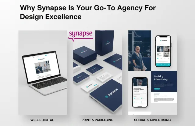
Why Synapse Is Your Go-To Agency For Design Excellence
Most brands don’t just need a new mark. They need a partner who understands how logo and font design fit into the bigger brand story. Synapse does this every day for growing companies. The focus is simple: craft visuals that look good, feel right, and stay strong across every place your brand shows up.
Synapse is one of India’s long-standing creative agencies, founded in Goa in 2000. The team works across branding, content design, and business communication, so ideas can move from concept to execution without leaving the building. That means one partner handles your logo, typography, visual identity, and brand story in a joined-up way.
The thinking behind each project is strategic, not cosmetic. Designers look at brand goals, audience needs, and context before sketching anything. Typography choices support the logo, color, and layout, so everything pulls in the same direction. This user-centered, brand-consistency mindset helps your right logo feel clear on a screen, on paper, or on a signboard.
Synapse’s work shows up in real brands people recognize. Case studies feature Doc Vidya by Dr. Reddy’s, PIA and GDIZ in West Africa, Medanta, Mahindra, Kotak Life, Nutanix, IIS Ahmedabad, and more. These projects span logo design, visual identity, and communication pieces, proving the team can help both new and established brands stand taller.
Working with Synapse also keeps the process simpler for clients. There is no need to juggle one vendor to make a logo and another to shape the brand book. One team handles discovery, design, refinement, and rollout. That cuts hand-offs, reduces confusion, and often leads to a faster, cleaner launch of the updated visual identity.
The experience is meant to feel collaborative, not overwhelming. Clients see options, explore what each version says, and can get inspired before locking into the final system. The team keeps an eye on how each decision will age, so the identity does not look tired a year from now. In every step, the work aims to make your logo and typography feel like a natural extension of your brand, not a costume.
What To Expect When You Engage With Synapse For Logo And Font Design
Starting a branding project can feel big. You want to know what happens, who does what, and when you will finally see your new visuals. When you engage Synapse for logo and font design, the process stays simple and collaborative from the first call to the final files. There are clear stages, and each one has a purpose.
1. Discovery: Getting To Know Your Brand
Everything begins with a detailed but relaxed discovery chat. Synapse listens to your story, market, and goals, along with the business name and any existing brand assets.
The conversation usually covers where the brand is today, what is working, and what is not. You can share a brand brief, preferred colors, references you like, or even a logo today that needs a rethink. The aim is simple: understand what you want to convey with your logo before any sketch appears.
2. Concepts: Turning The Brief Into Visual Directions
Next, the design team explores possible directions. Mood boards, rough ideas, and early digital drafts start to give shape to your future identity.
You usually see more than one route. Each option has a different balance of symbol, typeface, and layout, so it becomes easier to react to something concrete. This stage is where you can experiment with different styles in a safe way, without committing too early. The goal is to narrow down to one direction that feels closest to the brand you have in mind. If you’d like a deeper look at how this works step-by-step, our guide to the logo design process breaks it down in more detail.
3. Refinement: Feedback, Tweaks, And Polish
Once a preferred route is chosen, refinement begins. Synapse gathers your comments, then adjusts proportions, colors, spacing, and typography with care.
Communication stays open and steady. Feedback loops happen through calls or email, not through long gaps and guesswork. You see updated versions, react, and watch the design grow more confident with each round. This back-and-forth helps the final mark feel like a shared creation, not a black-box surprise.
Common doubts, such as how fast you will get a logo in hand or how the mark will behave on different backgrounds, are addressed along the way, not at the end. These are the kinds of things that usually show up in frequently asked questions, and the team knows to cover them early.
4. Final Deliverables And Hand-Off
After the design is approved, Synapse prepares a clean, organized delivery pack. You receive master logo files in multiple formats, including vector files, PDF and SVG, along with web-friendly exports.
A version of your logo with a transparent background for your convenience makes it easy to place the mark on photos, textures, or color blocks. The pack usually includes clear notes on color codes, minimum sizes, and spacing, so the logo even looks right when used by partners or vendors.
Depending on scope, a brand book or style guide may also be part of the hand-off. This document explains how the logo and chosen typography should appear across digital screens, print layouts, and signage, keeping the identity consistent on every touchpoint.
5. Timelines, Collaboration, And Value
Most branding and identity assignments run over clearly defined phases, with timelines agreed upfront. Each phase has a start, a review point, and a wrap-up, so you always know what is happening next.
Synapse works as a one-stop partner: discovery, logo exploration, typography, brand book, and collateral can all sit under one roof. This means fewer hand-offs, fewer miscommunications, and a smoother path from idea to launch. For clients, that usually translates to faster turnarounds and less time spent coordinating multiple vendors.
Pricing stays transparent. Instead of one flat sticker, Synapse frames competitive packages based on your needs, whether you want only a new mark or a full identity system with collateral. What you get is clear: a polished logo, a matching typographic system, and the guidelines needed to keep everything on-brand.
Clients come in with clarity about the inputs required: a simple brief, any existing materials, and a sense of where the brand needs to go. Synapse brings the strategy, design craft, and process discipline. Together, that mix turns a loose idea into a finished identity you can use with confidence across every channel.
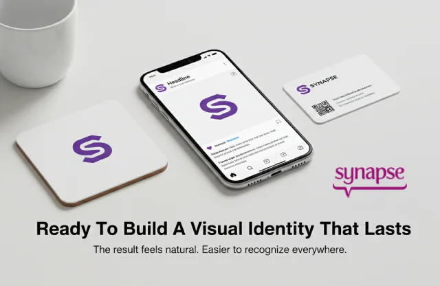
Ready To Build A Visual Identity That Lasts
For any modern brand, logo and font design is more than decoration. It acts like the face and voice of your business, showing people who you are before they read a single line. When colors, shapes, and type work together, the result feels natural. It also makes your communication easier to recognize everywhere.
That is why it helps to go beyond a quick font logo maker or basic logo generator. Synapse, a top creative agency in India with over two decades of experience, brings strategy, storytelling, and craft into every project. The team thinks about how your logo including typography will show up on screens, packaging, print, and social media. The aim is to create a version of your logo that still looks strong years from now.
If you are ready to invest, the next step is simple. Explore our Showcase to see how we help businesses find the perfect visual identity. Visit our Services page for a better sense of how we approach branding and communication. You can call 1800 121 5955 (India), email contact@synapse.co, or reach us on WhatsApp to talk through your needs. There is also a Contact form on the website where you can share your project details. With the right partner guiding your logo and font design, you do not just make a font logo. You give your brand a story people remember.


