


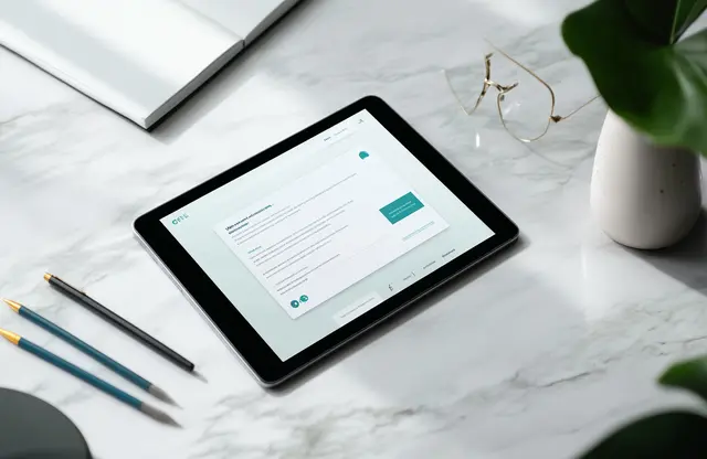
Mailer design looks simple, yet it does heavy lifting in every inbox. A smart layout that is easy to use turns pixels into a friendly tap on the shoulder. With clear hierarchy, sharp colours, and enough whitespace, your message feels like a gift rather than a chore.
Grab the recipient’s attention early; otherwise, the scroll is brutal and silence follows. If visuals clash or copy rambles, the promise won’t resonate. Start by matching your email design to the story you want to tell. A weekly newsletter needs warmth, while a limited-time offer demands urgency. Match tone, length, and format for each type of email.
Good email marketing keeps the reader moving forward, one click at a time. Think about user experience first. Crisp graphic design guides the eye, balanced typography supports the pace, and tight email content delivers value fast. Test send times, colours, and buttons, then adjust based on open and click data. Small tweaks compound into big gains.
Remember, physical mailers still charm, yet the digital channel lets you iterate at lightning speed. Treat each send as a rehearsal for the next show. With steady curiosity and a bias for clarity, mailer design becomes your quiet growth engine, pulsing out wins campaign after campaign.

What is Mailer Design?
Mailer design blends copy and visuals so recipients open and act. It depends on smart graphic design for layouts, colours, and other email elements that follow strict brand guidelines. Each send feels familiar yet fresh. Guides stress clear structure, legible type, and a strong call-to-action.
Modern campaigns may still use postcards, yet most brands lean on email design because it moves fast and costs less. Effective email design keeps copy concise, loads quickly through responsive design, and links smoothly into wider marketing campaigns. Whether run in-house or by a branding company, teams often hire a creative agency to craft professional brand visuals for mailers that match voice and tone. Mastered this way, mailer design bridges brand and customer, boosts response rates, and fits every type of email into one cohesive plan.
Types of Mailers
Here’s a list of different types of mailers that you or your company can and may send out:
Postcards
Flat cards (≈ 4 × 6 to 6 × 11 inches) travel without envelopes, keeping costs low. Ideal for flash sales, event reminders, and fast brand nudges.
Letter Pack
One or more pages inside an envelope add privacy and formality. Perfect for detailed offers, sensitive updates, and longer storytelling.
Self-Mailer
A folded, tab-sealed brochure needs no envelope. Extra panels host step-by-step narratives, coupons, or product highlights—great for launches.
Catalog & Mini-Catalog
Booklets present full or curated product lines. They shine during seasonal pushes when customers need plenty of choices in one place.
Dimensional Mailer
Boxes, tubes, or thick packets create “wow” moments with samples or gifts. Higher costs suit VIP prospects and a memorable unboxing.
Newsletter (Print or Email)
Recurring updates mix articles and tips, nurturing long-term relationships and cementing thought-leadership status.
Coupon or Voucher Book
Booklets packed with tear-off or scannable offers drive foot traffic and track promotion success over time.
EDDM Postcard
Oversized cards reach every address on a postal route. Best for local promos, grand openings, and community notices needing full coverage.
Triggered Email Mailer
Automated emails fire on specific actions—cart abandonment, sign-ups, renewals—hitting inboxes when intent peaks and boosting returns.
Promotional Email Blast
One-off HTML emails push urgent offers with bold visuals and clear CTAs, excelling at holiday deals, flash discounts, and new-product drops.

How and Why Professional Mailer Design Increases Your ROI
Smart mailer design often decides whether a new customer steps in or scrolls past. When attention spans vanish in seconds, small design fixes can boost revenue quicker than pouring money into ads. Below, we see how polished layouts turn print and digital mail into profit engines.
Polished graphic design keeps eyes on the page long enough for curiosity to bloom. A 2024 survey showed direct mail earning up to 112% ROI, far above most channels, because the envelope wins the attention span and improves the reading experience.
Clear, benefit-led body copy and crisp readability push response even higher. Mailers that mirror the best email design rules inside wider email marketing funnels hit 4.4% response, versus 0.12% when messages drift.
Seasoned creators add value early. Their creative typography keeps offers vivid, while a trusted branding agency aligns every hue with the existing logo design services. The result feels promotional without shouting, a mix many consider essential for keeping printing and postage spend under control.
Numbers tell the DIY story. A Florida pizza chain saw a 299% return after hiring pros to redesign its coupons, while generic digital blasts average 93% ROI at best.
Choose pros once, and printing costs pay you back many times; smart mailer design will keep doing that every quarter.

Define Your Audience and Irresistible Offer
Before any brilliant art lands in an inbox or letterbox, you must know who should see it and what will make them act. A little homework here saves budget later and sets up every mailer design for smooth, measurable wins.
Audience Segments: Age, budget, pain points
Start with the facts. Segment by age ranges, spending habits, and daily annoyances. A young professional may want rapid delivery; a retiree may chase value. Map these insights to colours, icons, and brand patterns that match your wider visual identity and overall graphic design. Signal quickly why the recipient cares. Then link each group to the right type of email, whether a welcome note or a seasonal offer. Segmented lists can lift direct-mail response by more than 130 percent.
Offer Essentials: Benefits, urgency, easy redemption
Now craft one promise that fixes a problem. Make it clear, make it fast. Use strong verbs to convey the gain and a button that urges recipients to click. Pair words with shapes that echo your logo design and wider brand identity. Pick a friendly font for body copy and keep it short. This focus removes creative bottlenecks that slow approvals. Whether an online code or a glossy flyer design, ensure redemption takes seconds. Wise teams test small tweaks, then roll the winner across the full email campaign. A crisp offer, matched to need, can double response compared with broad discounts.
Nail these basics, and your mailer design turns curiosity into revenue with surprising speed.
Design Layout, Copy, and Visuals That Convert
Great campaigns begin with design that guides the eye like a well-lit path. When mailer design marries crisp words and balanced visuals, readers glide from greeting to click, and budgets smile. Below, discover how smart layout, copy, and images turn that glide into real gains.
Layout Grids: Z-pattern or F-pattern
People scan pages in shapes. The Z-pattern drags their gaze in a zig-zag, perfect for splashy screens, while the F-pattern favours text-heavy layouts. Place the headline on top-left, slide across, then drop to details before the CTA keeps attention locked. Eye-tracking studies back this simple route.
Clear lines and spacing let an email builder arrange blocks fast, and you can use headings to flag each stop. Always test three colour palettes against brand rules, then check every hue at print size to stay sharp and on-brand.
Copy Rules: Active voice, no jargon, benefit-led
Email design matters, yet words close the deal. Short bursts—about twelve words—are easy to read and hold focus. A magnetic subject line opens the door, and a large font size keeps scanning smooth. Strong verbs, plain language, and one clear promise help you create trust quickly. Stick to a simple format and guide the eye toward the final call-to-action button. Readers act sooner when every phrase feels human and direct.
Visual Choices: High-resolution images, brand colours, readable fonts
Design thrives on balanced text and visuals. Generous whitespace boosts comprehension by nearly 20% and makes offers pop.
Lean on expert typography design services to pair headers with body copy fonts that stay readable across screens. Keep graphics and shades on-brand, then weave a subtle accent to steer the eye. A single, bold visual paired with a tight caption feels more promotional than pushy. Coupled with coherent logo design cues, it locks your audience into the narrative without distraction.
Master these elements, and mailer design turns casual glances into measurable clicks, proving every layout decision can widen your return on investment.

Choose Print Specs, Formats, and Finishes
Print choices turn mailer design from a flat idea into a keepsake. Before ink meets paper, think size, stock, and finish, because each detail shifts cost, feel, and response. A quick tour of options below spares painful reprints and keeps spending within reason.
Postcards range from 4 × 6 up to 6 × 11 inches. The smallest size mails at the lowest rate and suits quick, punchy notes, yet space is tight for long copy.
Trifold brochures fold an 8.5 × 11 sheet into thirds, giving six small panels for stories or menus, but they weigh more and may need an envelope if privacy matters.
Self-mailers skip envelopes and cut assembly costs, though exposed edges can scuff in transit.
Envelope packs look formal and shield inserts, yet higher printing and stuffing fees raise the bill.
Paper weight shapes first impressions. Lightweight 80 lb text stocks feel economical and mail cheap, while 100 lb cover or 14-point card carries luxury heft. Coatings change touch: gloss pops colour, matte mutes glare, and uncoated stocks suggest craft or eco values.
Finishes lift perceived value fast. Foil stamping catches light, embossing adds texture, and spot UV paints selective shine. Each effect invites fingertips, and studies link these tactile extras to higher open and recall rates.
Check postage classes before you lock art. Standard postcards start at about INR 48, but oversized pieces pay letter rates, and any item over 3.5 oz bumps into pricier tiers. Plan weight early to avoid last-minute trims.
Choose specs that echo brand personality—thick matte card for prestige, lean gloss for budget speed—and your next mailer design will look premium without overspending.

Track, Test, and Improve Every Campaign
Sharper numbers keep the mailer design honest. With clear tracking, even small campaigns learn fast, spend less, and grow profit.
Key Metrics: Response rate, cost per lead, conversion rate
Print a unique promo code, QR code, or phone line on each piece. Scans or calls flow into one sheet, showing you exactly who answered which offer. Brands that tag mailers this way report ROI as high as 112%, more than any other channel.
Iterative Steps: Review, tweak, relaunch
Set a response goal before the first drop, then log daily results in a simple spreadsheet. Run A/B tests on a few hundred pieces—one headline, one image, one colour shift. Scale only the winner. Mark a two-week review date, adjust artwork, and mail again. Small tests like these cut waste and lift returns in every fresh round of mailer design.

Synapse & Mailer Design: Driving ROI
Postcards or triggered emails—the idea stays simple: purpose-built mailer design beats louder, pricier media. Clear hierarchy guides the eye. Benefit-driven copy removes friction. Print specs that match brand personality lift response rates. Brands that segment lists, add QR codes, and test nonstop now report triple-digit ROI. Small tweaks, not big ad spends, spark the win. Print and email also work together. QR codes and promo links bridge the mailbox and website, so every rupee traces back to design.
Synapse turns those numbers into daily practice. Our strategists, writers, and designers pair sharp layouts with polished finishes. The result feels personal and looks premium. The Nutanix direct mailer design proves it, boosting registrations by turning the unboxing into an experience. Our agile workflow surfaces data after each drop, so creative decisions stay grounded in real clicks and calls, not guesswork. Dozens of similar wins sit on our project showcase, ready for a quick scroll.
Ready to see what fresh mailer design can do for your pipeline? Explore our work, then reach out: call 1800 121 5955 (India), email contact@synapse.co, ping us on WhatsApp, or leave your details in the Contact form. A short chat is all it takes to start crafting the next mailer people can’t ignore.


